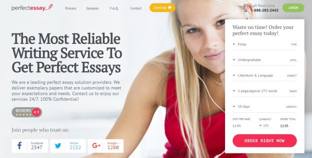
Review of superiorpapers.com
The superior papers site offering writing services to students in all fields of academics. The site can be called an e-commerce site through which the company or organization sell their services. The services they offer are to help students in writing their papers. The essence of a website is to present the picture of the company. It, therefore, should be appealing to the users and attract them. What attracts the users, at first sight, is the design. The design of the website will entice the visitor to the site to look further for more information. It is the first impression, and therefore it should be attractive and impressive. The other things that follow the design are things like the support team of the site, the prices, the social media marketing activities and the availability of the contact information.
Design
The simplicity of the design of the site layout is appealing. It is clean, visually appealing, professional and polished. It is easy to structure/design and update. The intelligent use of flash technology creates an impression to the user. This leaves them with a positive overview of the entire site. They would want to scroll further to get more information. The choice of color is good because they used a bright color on the first page. However, the blend is not that attractive. The blue is “screaming” and the red too. It could have been good if they could have blended a bright color and a dull one. Then they could have used at least three colors. The graphics are minimal and meaningful which makes the site impressive. The images are of good quality. The text is visible and therefore can be easily read. The combination of the text color has brought out this well. The use of black text on white background and white on the dark background makes it visible and easy to read. However, the fonts seem faint, and a darker one would be advisable. The simplicity of the layout is also visually appealing. The white space has been allowed, and it is adequate. The layouts are uncluttered which allows the users to get to view the message instantly. Animation has been employed, but it is minimal which makes it impressive.
The content of some pages is short and well organized. However, the second last page’s information has been done in long prose which is sometimes tiring and in most cases, may keep off the user before going through it. The menu has not been placed on the first page, and therefore the user has a long way of scrolling to get the information they want. This is tiring, and the user may log off before obtaining the required information. In turn, making navigation of the site complicated. It is advisable that the menu is placed on the top page or the sides so that the customers can acquire the necessary information as quickly as possible right from the top. There are some elements of inconsistency in the layout which complicates the usability of the site. The pages, however, are fast-loading. The screen resolution is good but not the best. It would be better if the pixels of the resolution could be increased a bit.
All the components function just perfectly well. The hyperlinks, the site search, and the contact form work correctly and quickly. The copy is error-free regarding typos, grammatical errors, punctuations, and misspellings.
Team Of Writers
The superiorpapers work with highly qualified professional writers. These writers are of Ph.D. and MA levels. The writers are offered with bonus and incentives which boost their moral thus delivering quality work. Quoting from the site, “We have highly qualified Ph.D. and MA writers working with us, but we offer these experienced writers certain bonuses and incentives to make them deliver highly original, unique, and informative content at reasonably low prices. It means you should expect high-quality work delivered in a timely manner without having to worry a lot about prices.”
However, the information about customers services where the customer questions and concerns can be addressed is not provided. Do they have customer service representatives? Whether they have the customer service representatives or not have been mention and this should be one of the areas that the designers of the site need to address.
Prices
The prices of the services are quite affordable for any average person. The option of checking the prices has been provided which is a good thing. The steps followed when making an order are also quite simple. What the customer needs to do is to fill the order form. After filling the order form, the company finds a writer who has specialized in the area. The customers then checks then fills the order form once more after checking if all areas have been furnished. The work is then delivered directly to the customer’s inbox. The specifications of when the payments are done have not been provided, and this is one area that needs to be rectified. They offer up to 15% discount which makes the site attractive. The payments are securely processed by MasterCard, Visa, American Express, Maestro, and Wire Transfer among others.
Social Media
The site indicates that the company has also gone overboard into social media marketing activities. It has marketed itself through the social media. This makes it compete effectively with its competitors. The target market here is students. Most students are teenagers or youths, and everyone knows how obsessed this group of individuals is with social media. The company can be followed on Facebook and Google. However, it would be advisable if they navigated Twitter, Youtube, and other social sites. They need to create pages on these social sites from which they can be easily accessed.
Contact Information
Right from the first page, the contact information has been provided. The user can contact them directly via telephone, or they can start a live chat. This is a good approach which keeps it ahead of the other sites.